
Concepts & Development
Below, we present to you various graphics, designs, or structures that we have revised or completely discarded over time. The museum is intended to document the development of our website and to show interested users which mistakes can be avoided in web design.
|
Regrow Logo
The development of our logo is truly impressive. From the initial sketch to the finalization of the logo, a significant amount of time has elapsed. We created the designs using Gimp and continuously redesigned them. Our trademark should be as simple as possible from the very beginning and remain memorable. Over time, we found the neon green color to be too vibrant, which is why we replaced it with a softer green.
|
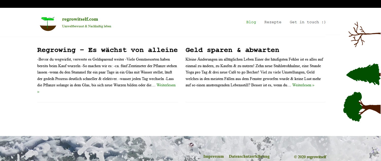
Regrow Trees
Shortly after the website went online, we placed three trees as a background image on our homepage. We positioned the trees on the side in the background and let them scroll along with the page. However, since the mobile version posed some challenges, we redesigned the trees and placed them as an image on the homepage. After the homepage was redesigned, the trees disappeared completely. Further down, you can see how (terrible) it looked back then.


|
Did you know…?
… that it took us seven months to decide on a homepage?
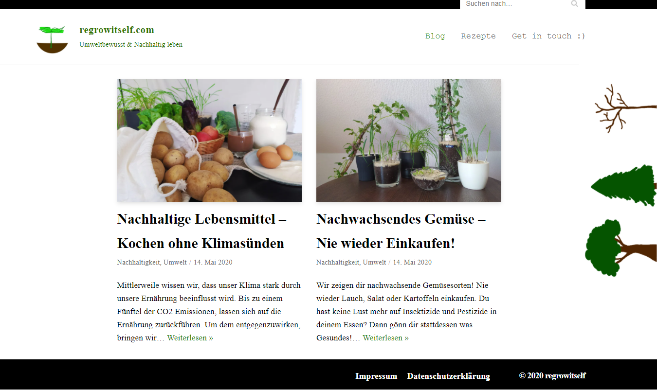
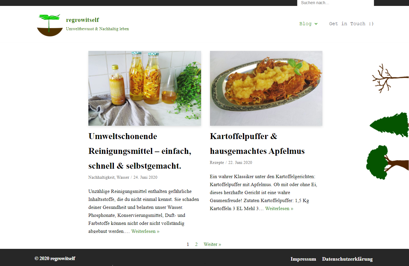
Initially, we only had a dynamic page as our homepage, displaying only the latest posts. Due to the dynamic structure, the homepage lacked substance, and the website’s theme was not evident. After over half a year, we decided on a static page with dynamic content.
With the new homepage, we aimed to create a certain structure. Users should immediately see what our blog has to offer. Yet, the former homepage wasn’t lost; it became our blog page. You can see how the website looked before and what designs we used in the following series of images.


…that the shop operates on a separate domain?
The “regrow shop” operates on its own domain and is technically not part of “regrow itself”. The shop was also created months after the blog went online. We spent a long time considering about the best approach to integrate an online shop into our website. There are countless possibilities for implementation. The reasons why we ultimately chose the solution with a separate domain were various:
- If one of the websites experiences disruptions or downtime, the other site continues to operate.
- The shop was still in its early stages and didn’t have a specific theme or goal yet.
- The traffic generated by users is reduced for both websites.
- If the shop no longer fits the concept, we can easily separate the sites from each other.
- Each site allows for individual customization of graphic elements, including font size, colors, and layout.
- Security issues only affect one website.
… that we initially had two blogs?
We started with two separate blogs in March 2020: Regrow Itself & Boneplayground. Both blogs covered different topics. Regrow Itself focused on environmental issues and sustainability, while Boneplayground was intended for various lifestyle topics.
Since managing a single website or project already demanded a significant amount of time, we decided to discontinue Boneplayground. Additionally, Regrow Itself showed more potential, and it was not feasible to combine the shop with Boneplayground. Most of the content from Boneplayground has been revised and integrated into Regrow Itself.
We also want to introduce you to some remnants of Boneplayground. This includes the development of the Boneplayground logo and the “topics” section, which we will discuss further below.

…that we had a topics page during that time?
The topics page was an idea that fortunately only persisted on Boneplayground. It was a page where all categories and keywords were linked. The purpose of the topics page was to make the blog more organized and assist in finding posts.
In practice, however, the topics page had the opposite effect. Now we had all categories duplicated: in the navigation menu and on the topics page. The keywords seemed more like spam and only caused confusion due to the low number of posts. Additionally, it proved difficult to add new categories.
On the other hand, the navigation menu served its purpose wonderfully, and the topics page eventually became unnecessary. Nevertheless, the creation of the topics page is very interesting. The following series of images shows the evolution of the page. Feel free to also take a look at the old sidebar.


…that we are die-hard BioShock fans?
The idea for the Regrow Museum came to us on a rainy afternoon while playing “BioShock“. There is an exclusive level in the game with 3D models and designs that were removed from the final version. Such exclusive levels are common in video games.
Nevertheless, we had not yet come across a website that documents its own development in such a manner. This inspired us to create our own unique museum.
|
The drama with the About page:
By far the most challenging page for us from the beginning was the “About” page. Writing a text about ourselves and the websites was not easy for us at all. The “About Us” page lacked structure and was a total failure in terms of design.
This was probably because the websites were still under construction and did not yet have a real goal or vision. Perhaps we were unsure of how we wanted to present ourselves to others, or at times, overly critical of our self-representation.
Whatever the reason, the changes are tremendous:


|
Graphics
Finally, we have some additional images for you. Some are from Boneplayground, while others were simply never used and have now found a place in the museum.


